

Classmates.com is a social networking platform where millions of users reconnect with high school friends, organize reunions, and share photos and life updates. The product team set a goal to boost user engagement, but we faced two core challenges:
To understand the problem space better, I scheduled a 1-on-1 with the Product Director. I asked targeted questions to dig into user behavior and pain points.
Here’s what I learned:
This early insight guided the design direction—particularly the need to streamline navigation on mobile and reimagine how content is surfaced.
To better understand user pain points, I conducted a usability test with 10 active Classmates.com users. Each participant was asked to locate specific features using the existing navigation bar.

Result: 7 out of 10 users failed to select the correct page on their first attempt.
This test confirmed that the navigation icons were unclear—most users struggled to identify what each icon represented and where it would lead. The existing icons for private messages and conversations looked nearly identical and were placed side-by-side, further increasing confusion.
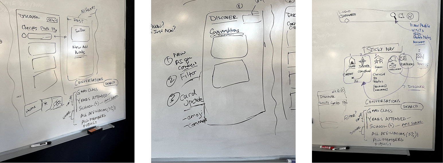
Considering that most users were over 50, I questioned whether icon-based navigation was effective for this demographic. This prompted me to test a more text-based approach.
I redesigned the navigation bar with clear text labels to replace the ambiguous icons. This improved usability and accessibility—especially important on mobile devices where space is limited but clarity is crucial.

In a follow-up usability test, I compared the original and redesigned navigation bars with 10 users.
Outcome: 70% preferred the version with text labels, citing improved clarity and confidence navigating the site.
If given more time, I would explore hybrid approaches that combine icons with supporting text.
To support the development team, I created annotated designs and documentation to ensure a smooth handoff. This helped the new navigation bar roll out effectively into the live product.

Even with better navigation, user engagement remained low. Many users mentioned there just wasn’t a reason to return often — one user said, “There’s nothing new to check on Classmates...”
So I turned my attention to the activity feed. It felt outdated and had very few interactive features.
To validate this direction, I launched a quick user survey, and responses confirmed the issue: users agreed that revamping the feed could motivate them to return more regularly.

I brought this issue up during a product team meeting, and it turned out they were already considering updating the feed in the future. We collaborated on early sketches and wireframes, refining how the new version could show more personalized and engaging content.
These discussions helped prioritize features that balanced user needs with business goals.
I also took a step back to evaluate how the new feed would integrate into Classmates' existing platform. To ensure a seamless experience, I mapped out the user flow, helping me visualize the steps users would take to navigate the feed.

After refining the overall concept, I focused on individual components of the feed. Based on initial research, I designed elements that would maximize user engagement — things like post previews, interactive features, and easy-to-navigate content.
I made sure to stick to Classmates' established design system so that everything felt consistent and aligned with the platform’s identity.

Using these components, I developed an interactive prototype in Figma, aiming for a smooth, cohesive user experience. I included elements like scrollable feeds and customizable content. The goal was to create something engaging yet simple.
Afterward, I tested the prototype with users to gather feedback on usability.

During the first round of testing, I specifically focused on the Feeds page. Users rated the feature highly on a scale of 1 to 5, with the average response being 4.5 — indicating strong enthusiasm for the feature.

The content relevance also scored well in the tests, with users rating it 4.27/5. This suggested that the content I selected for the feed was highly relevant to users, aligned with their interests, and would likely keep them engaged.

After gathering feedback from the initial prototype, I expanded it to cover the entire platform. This allowed me to incorporate the navigation bar changes across different pages, making sure the design was consistent and functional across all areas. The goal was to create a comprehensive experience for users to test.

When testing the full prototype with 10 users, the feedback was overwhelmingly positive:
The full test results confirmed the new design was a hit. Every participant was able to easily complete complex tasks using the new navigation, and users felt more engaged with the Activity Feed updates. Many mentioned that they were excited to use the platform more frequently with these new features. This feedback showed that the changes would likely improve user engagement and retention — the ultimate goal of the project.
The redesign of the navigation bar, once rolled out to the live platform, had a significant positive impact:
Despite the positive outcomes, there were a few constraints I had to navigate:
If I had the chance to continue, I would focus on the following:
These next steps would allow the product team to keep improving the Feed feature and ensure it continues to meet user expectations.
